Need help in using our WordPress theme?
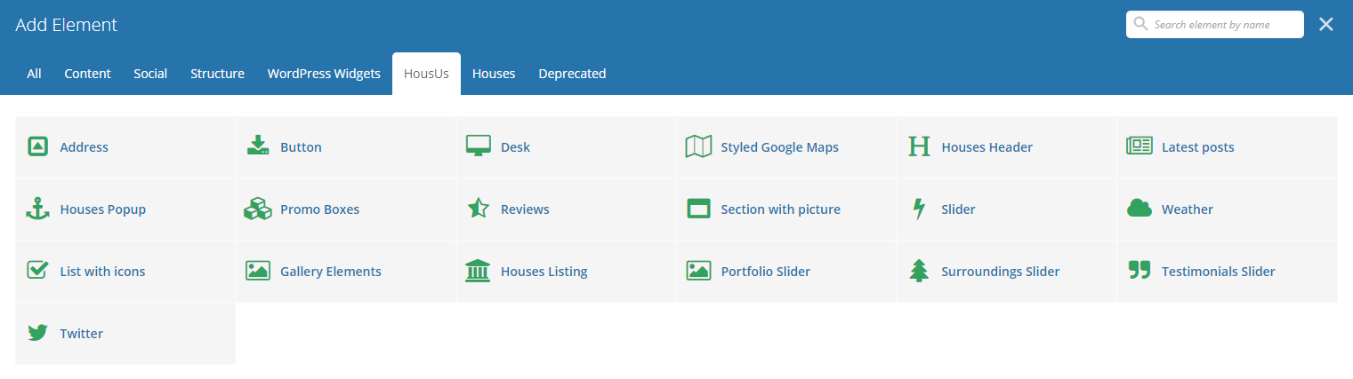
With HousUs comes custom shortcodes for (Visual Composer) VC that are used to show content created in HousUs.
Below you will find short information about this Visual Composer elements:
|
|
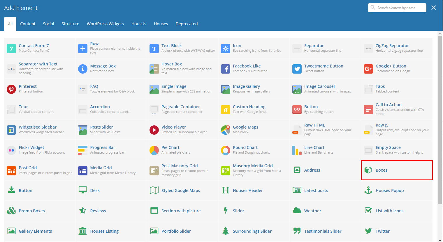
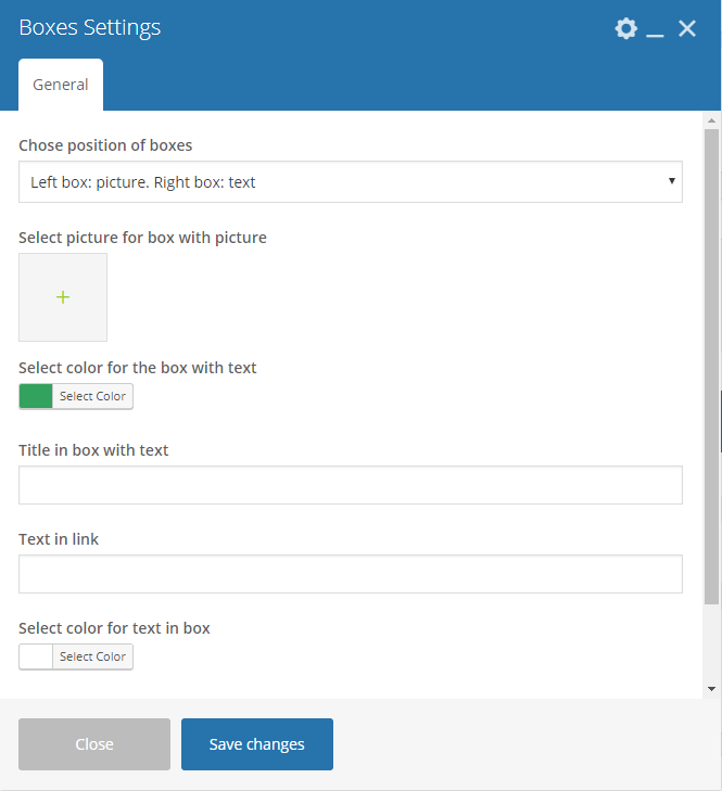
This element will let you add boxes that has images and text inside.
|
|
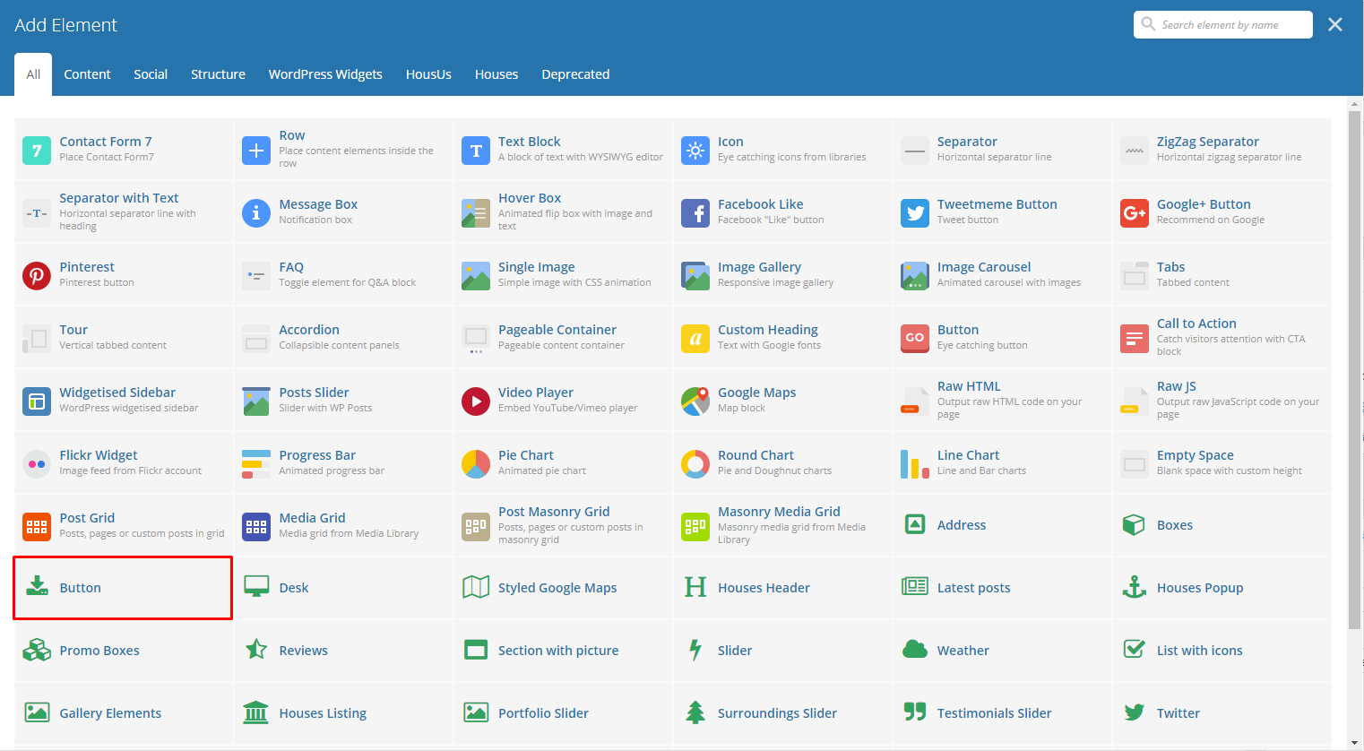
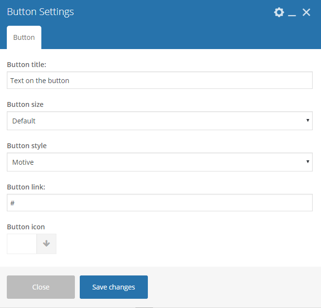
This theme comes with VC element that give you the option to create buttons that can be used in the theme.
|
|
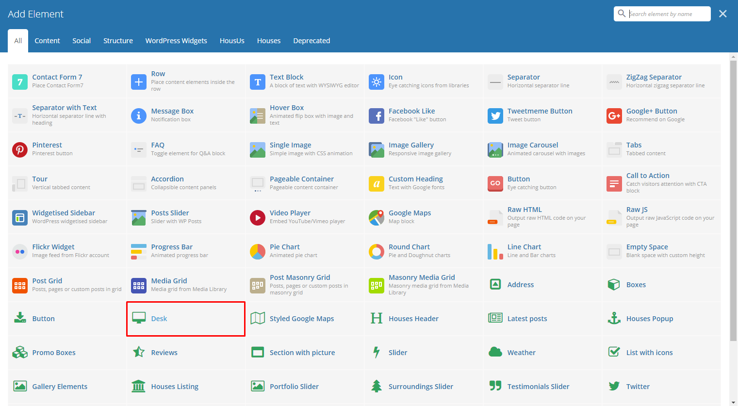
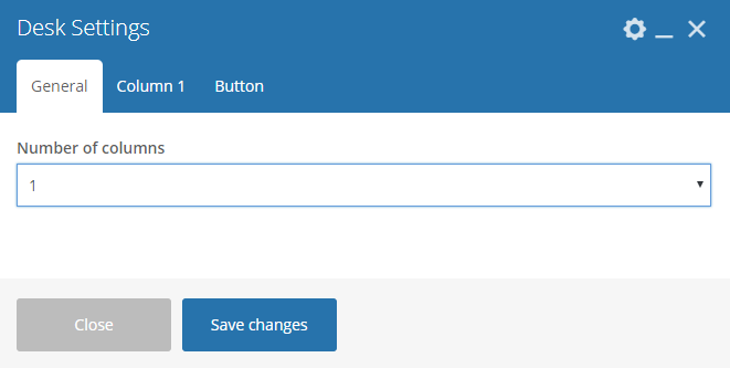
This element will let you add a set of columns that you can add a shortcode or post inside the column.
|
|
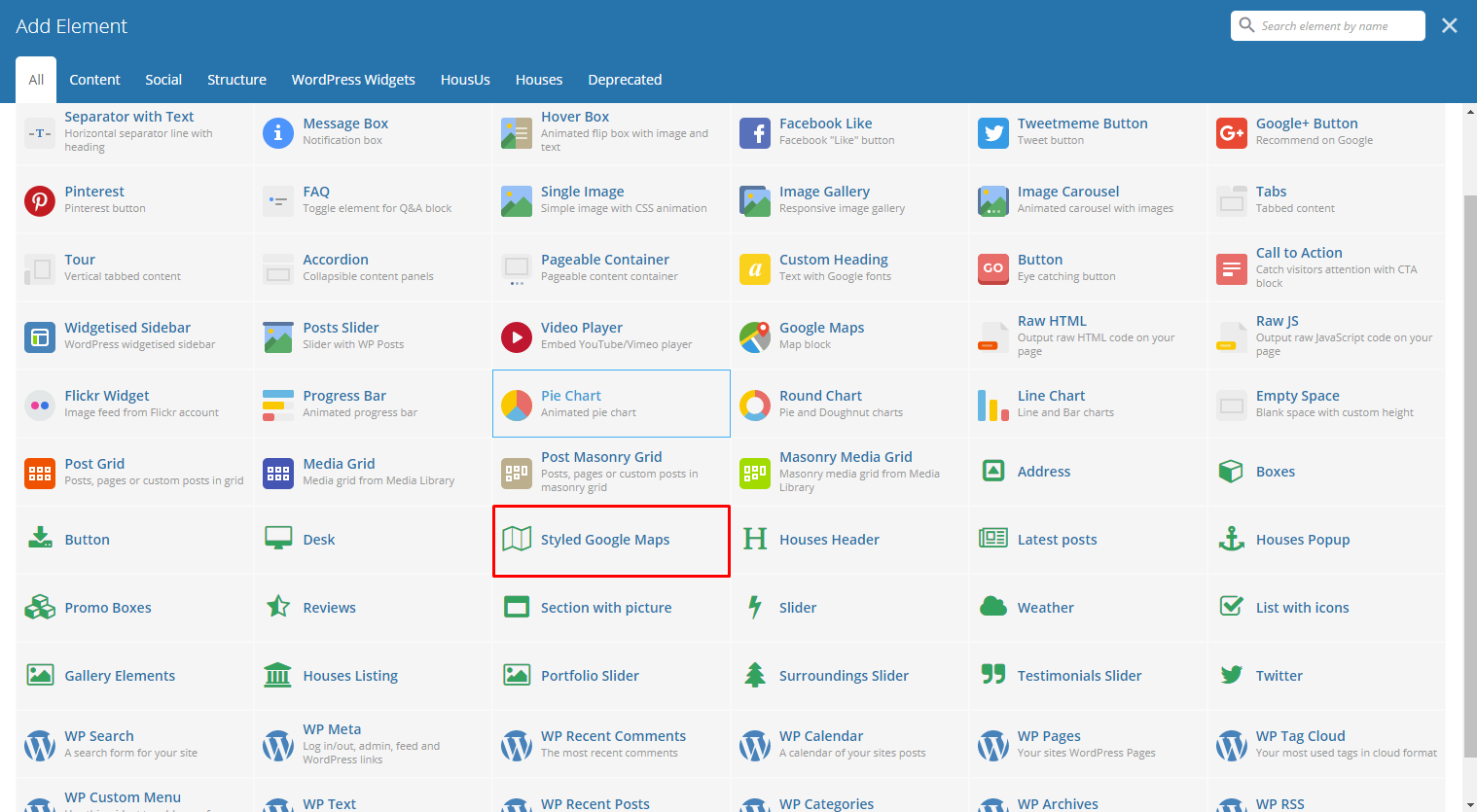
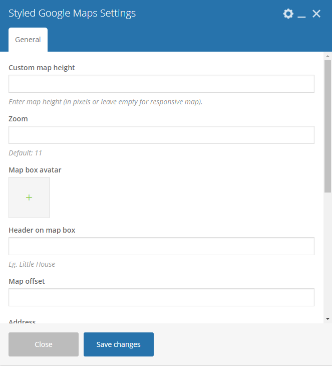
This element will let you add a google map with a specific address.
|
|
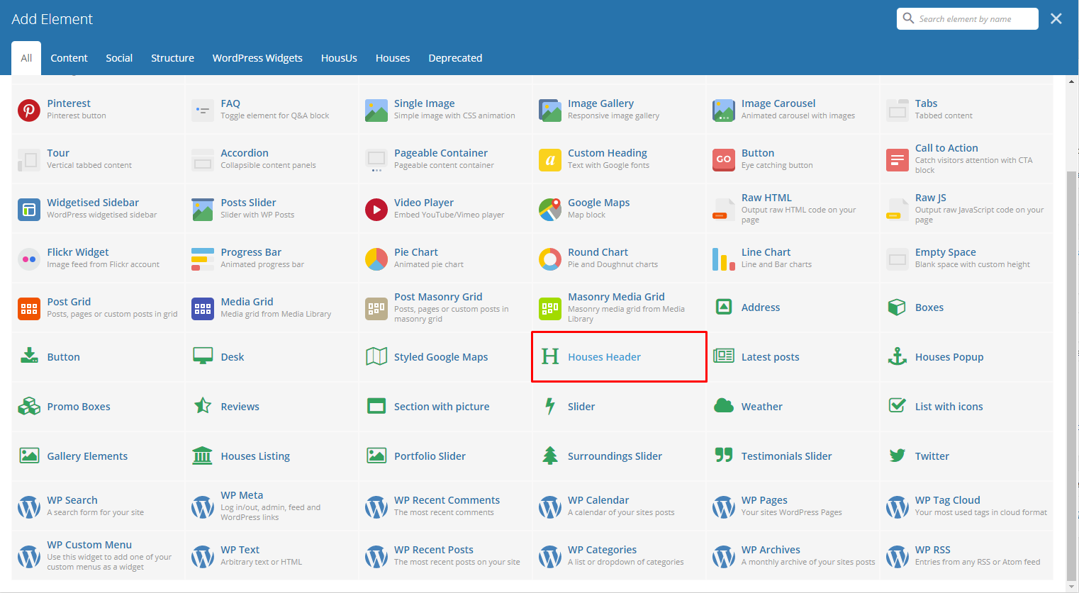
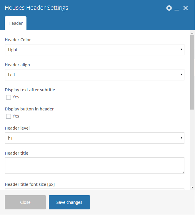
The element is a custom header for HousUs.
|
|
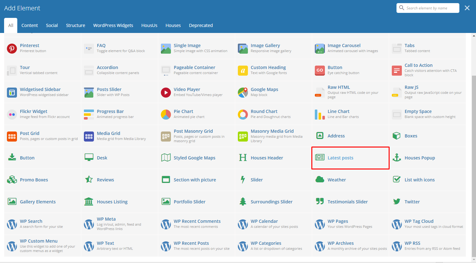
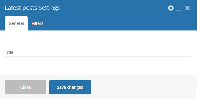
This will show the latest posts posted in the blog.
|
|
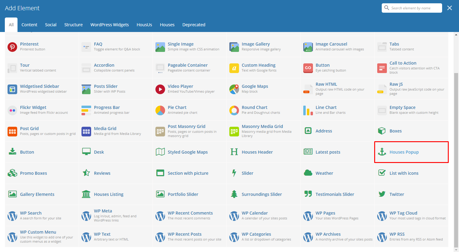
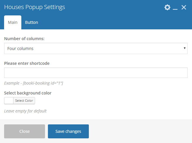
This element will let you make a popup for a selected shortcode.
|
|
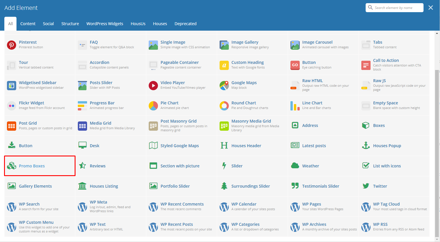
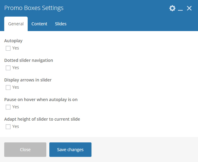
This element lets you add promo boxes that can be set to be dynamic.
|
Note
Format in writing the content inside promo box: Title^subtitle Separate each item with : “|” Sample: 20%^Off on Parties|10%^Off on summer
Color for box - Color of the promo box.
|
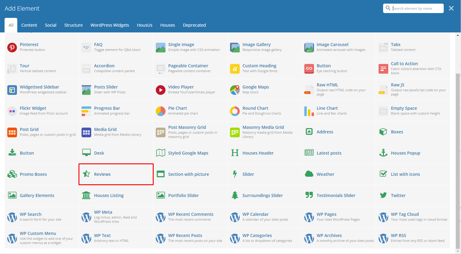
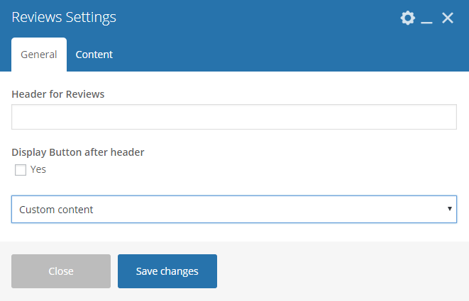
This element will let you show a rating section in your page.
|
|
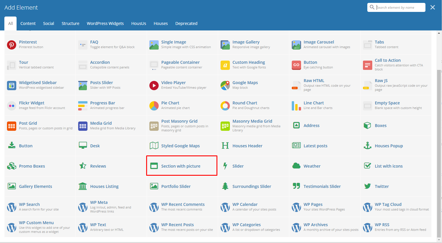
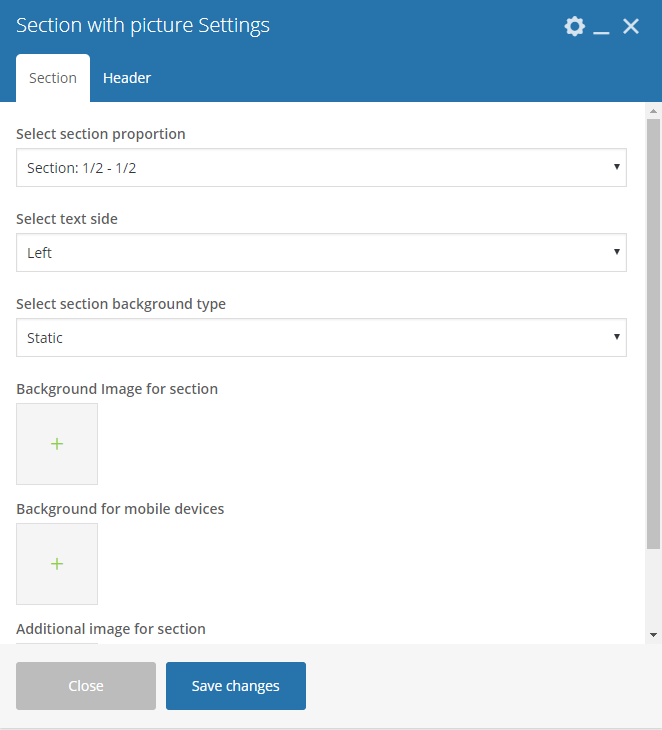
This element will let you have a section that has images and text.
|
|
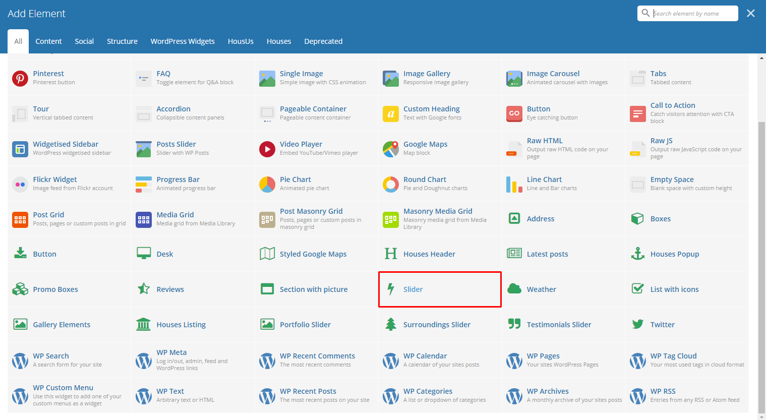
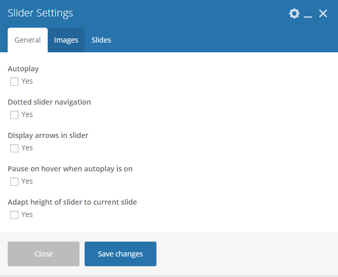
This element lets you add a slider with images that moves by itself.
|
|
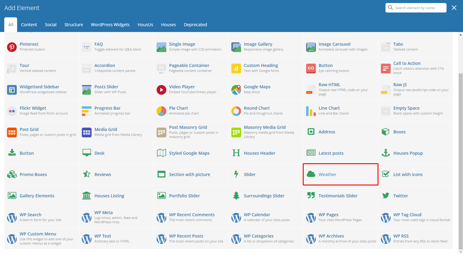
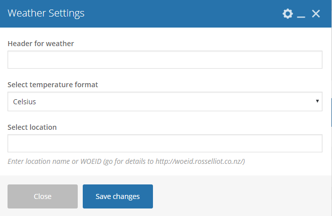
This element lets you add the weather of a specific location inside the page.
|
- Header for weather - Title for the weather element in the page.
- Select temperature format - Set the temperature format of the location.
- Select location - You can use the location name or a WOEID of the location.
|
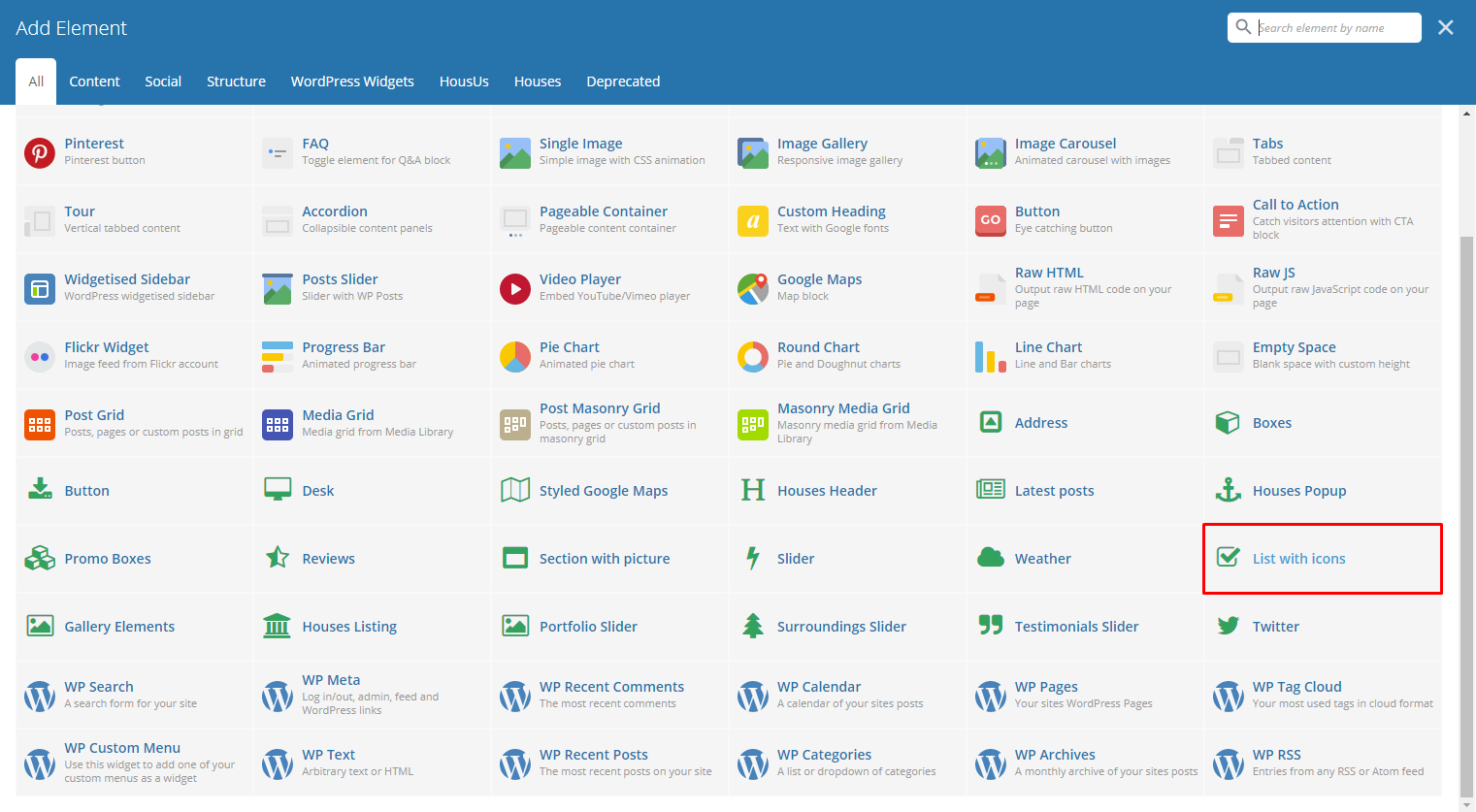
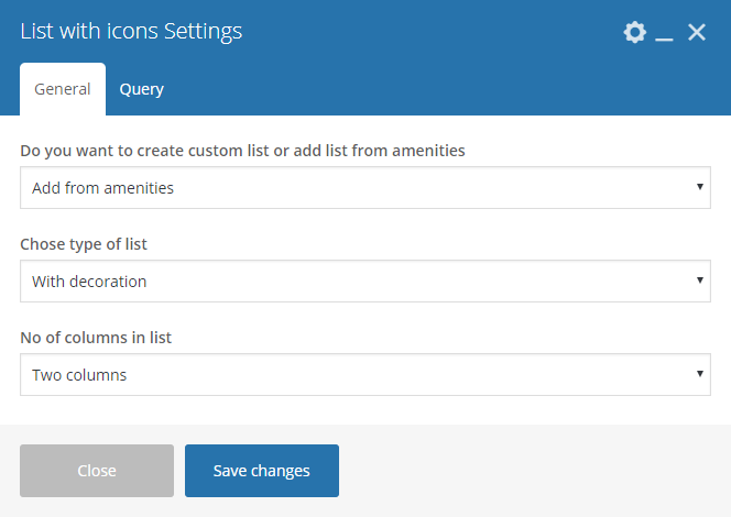
This element lets you add a custom list or a list from the amenities item in Amenities.
|
|
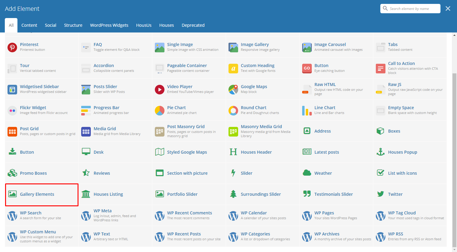
This element lets you add a custom gallery or items in the Gallery.
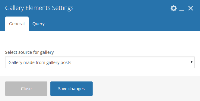
|
|
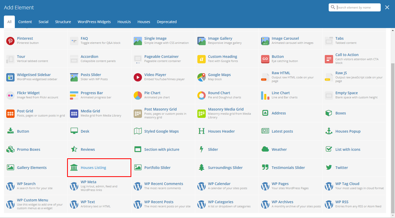
This element lets you show the houses items inside Houses.
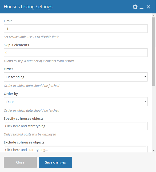
|
- Limit - Set results limit.
- Skip X elements - Skip a number of elements from the results.
- Order - How the posts order looks.
- Order by - How the posts are ordered.
- Specify ct-houses objects - Only selected posts are shown.
- Exclude ct-houses objects - None of the selected posts will be displayed.
- Specify terms of ct-houses-taxonomy taxonomy - Only show posts under the categories of houses.
- Exclude terms of ct-houses-taxonomy taxonomy - None of the posts under the categories of houses are shown.
- Specify post tags - Only show posts with selected tags.
- Keyword search - Show items with certain keyword.
- Type of houses listing - Set the number of columns to show the houses listing or to make it as a slider.

|
This element will let you add a surrounding slider in the page.
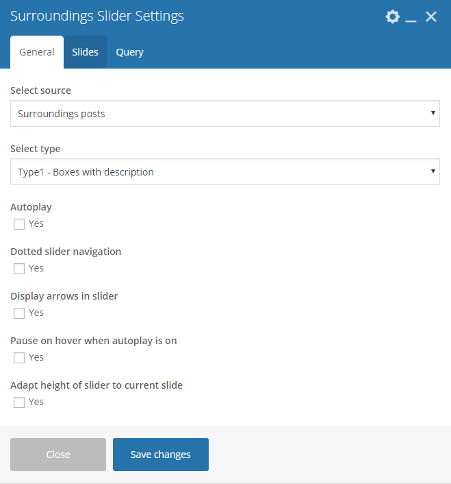
|
|
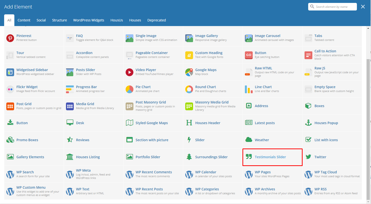
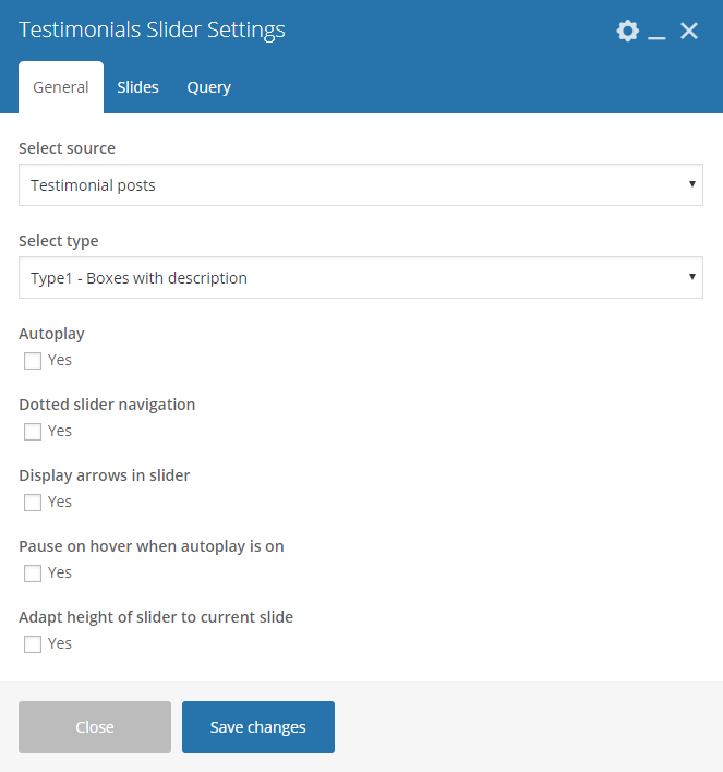
This element lets you add testimonials to a page.
|
|
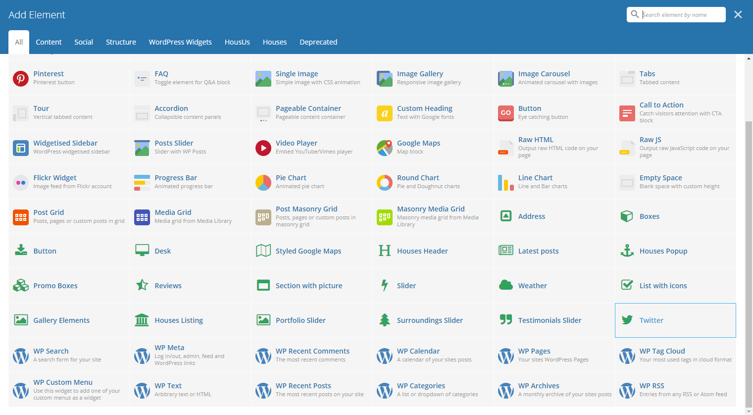
This element lets you show the latest post on a twitter account set on this slider.

|
Note
The information how to generate twitter keys and tokens can be found here.